Renewergy is a visual identity & brand exploration I designed for a utility company providing power with solar, wind, and natural gas energy sources to homes in Ithaca.
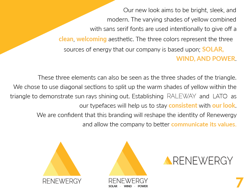
The main goal was to separate their brand from the typical utility company branding with green & blue colors, but still stay modern and relevant enough to seem like an energy company.
My main personal inspiration while creating this brand identity was RGE.



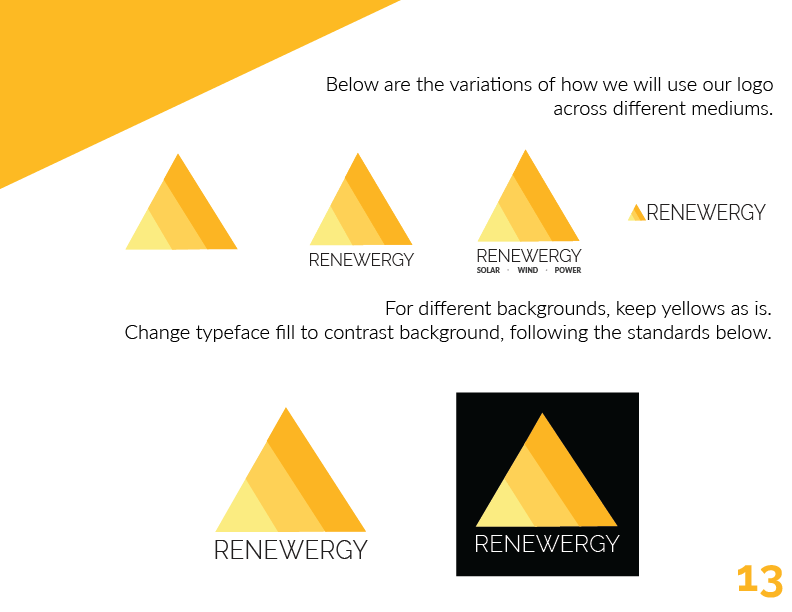




Looking back on this project, there are a few tweaks I would make.
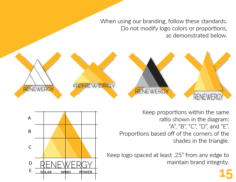
Firstly, the logo variations page -- where I've sectioned the logo based off of "A, B, C, D, E", the portions are not valued by line or size and are unscalable.
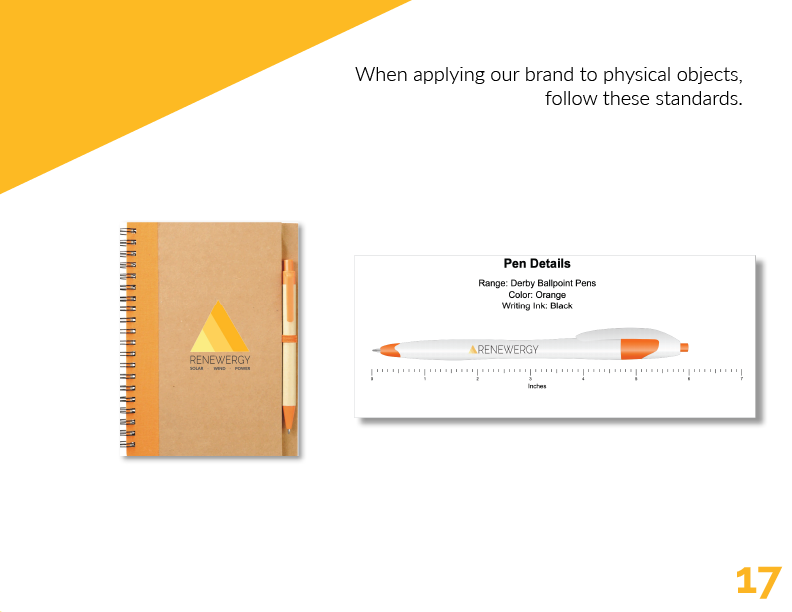
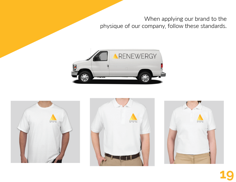
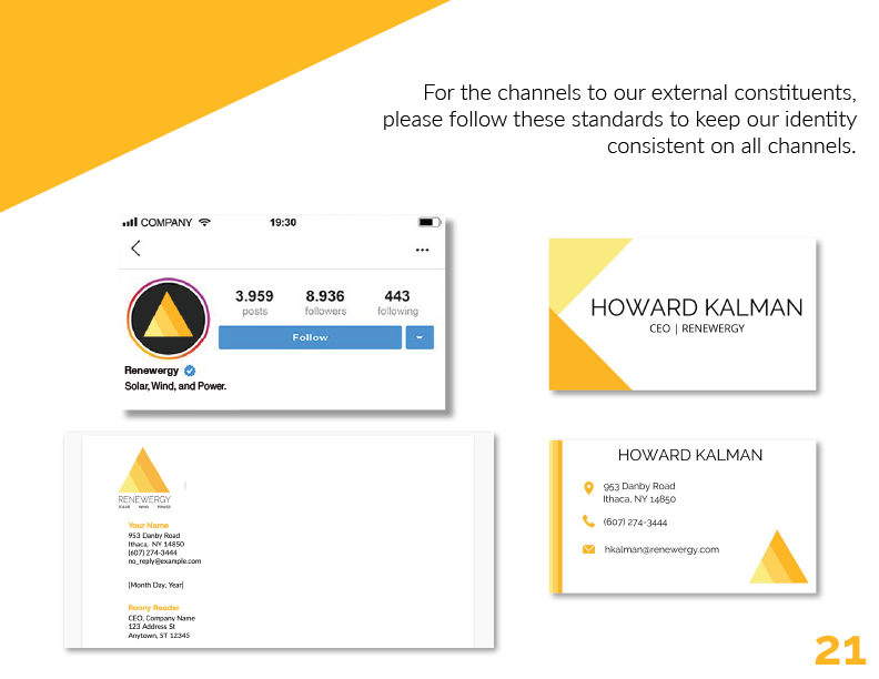
Secondly, I would have added more identifiable information on the standards, rather than visual. I used "follow these standards" accompanied by pictures, and I should have included specific rules such as "do not place our logos on a dark background, white only" or "logomark only is acceptable".
Looking to do something similar with your brand?